Perspective
Date: 30 October 2026
Why so many brands look alike, and what it takes to stand out.
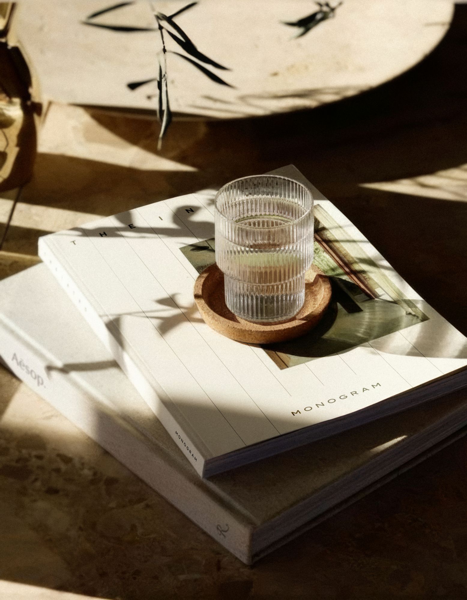
Most categories you scroll through are wearing the same clothes. Different businesses, similar identities, the same ideas dressed up in different ways. If you have ever looked at a new bank, a coffee shop and a mattress company and struggled to tell which was which, you have seen it. Now that AI can produce a logo, a website and a year of social posts in an afternoon, the problem is getting worse, and standing out matters more than it ever has. This entry looks at why so many brands look and sound the same, and what it takes to build one that doesn't.
The look everyone borrowed
Over the last decade, a single style spread across almost every category in North America. It started with a wave of direct-to-consumer startups and was copied so widely that it now feels like the default way to look modern: a clean sans-serif logo, often in lowercase, a soft palette of pastels or earthy neutrals, friendly illustrations, a chatty tone of voice and lifestyle photography of someone smiling in good light.
There is nothing wrong with any of those choices on their own. The problem is that they were chosen because they worked for someone else, not because they said anything about the business wearing them. When a fintech app, a meal kit and a dental clinic all use the same visual language, none of them owns it.
Why AI is making everything look the same
AI tools are trained on what already exists, so what they produce is, by design, an average of everything that came before. Ask one for a logo, a tagline or a brand voice and you will get something polished, confident and almost exactly like what it gives everyone else. The same smooth imagery, the same upbeat copy, the same promise to be innovative and customer-first.
That is useful for speed, and we use these tools in our own work. But when every business has access to the same shortcuts, the result is a flood of brands that look finished and say nothing. Polish used to be a sign that a business had invested in its brand. Today it is the minimum, and it no longer sets anyone apart.
The brands that will stand out in the next few years are not the ones with the slickest output. They are the ones that sound like real people with a real point of view, and that give customers a reason to care that no tool could have generated for them.
The only reliable brief
People haven't changed since they gathered around the fire. They want stories, status, belonging and beauty, the same things they have always wanted. What changes is where they stand while they want it: in a feed, on a screen, in a world where they see more brands in a day than their grandparents saw in a year.
Great brand work honours the first and respects the second. It speaks to what people have always wanted, in a way that fits how they live now. Everything else is trend-chasing with better fonts.
Standing out takes more than a look
A distinctive logo helps, but sameness is just as often a problem of words. Most brands now sound alike too, with the same cheerful, frictionless voice that could be speaking for anyone. Standing out means having something to say and saying it like a person would, with an opinion, a sense of humour and, above all, a heart.
With Rookie, a sports and lifestyle concept, we refused the drill-sergeant voice of the fitness category and wrote it like a text from a friend that just says "you got this". With ILL, we took a word people use as an insult and wore it as a badge of honour. With Veo, the whole brand rests on a warm promise, welcome to the good life, rather than the intimidation most gyms sell. In each case, the look matters, but it is the message that people hold on to.
What it takes to stand out
Standing out takes more than following what's working for everyone else. It takes understanding what makes a business worth noticing, then translating that into something people can see, recognise and remember. In practice, that comes down to three things.
Start with what is true about the business. Every business has something no competitor can copy: its people, its origin, its way of doing things or the customers it chooses to serve. That is where a distinctive brand comes from, and finding it is the first job, before any design or copy.
Know what your category looks and sounds like, then step away from it. We study the category closely so we know exactly which clichés to avoid, from the colours everyone uses to the words everyone repeats. Rookie, for example, refuses the neon colours, lightning bolts and elite-athlete imagery that fill sports drinks and apparel.
Be willing to be human. The brands people love have opinions, flaws and a personality you could describe like a friend's. That takes a little courage, because a brand with a point of view will not appeal to everyone. It is also the one thing AI cannot do on your behalf.
A brand with a heart
If your brand could belong to any business in your category, or could have been written by a machine in a minute, it is worth asking what makes yours different, and whether anyone would know it from the way you look and sound. There is a better brand behind every business, and a business behind every great idea. Finding them is why we are here. If you are ready to stop dressing like everyone else, write to us at info@fondu.studio.
More to read

Fondu opens in Canada.
Why we started a studio here, and what it means to be powered by Brandinc.
Read More
Where ideas are found.
The thinking behind the name, and the way we approach every brief.
Read More

Strategy and design, fused.
What changes when the people writing the strategy also design the brand.
Read More